Resources Hub


Measure What Matters: Engineering Impact with the aPriori Design Value Dashboard

Mark Rushton
| April 14, 2026
Listen to this Article
1×
00:00
00:00
Key Takeaways:
- Design decisions are rarely visible, and even more infrequently, quantified
- Yet, they have a profound impact on product cost and manufacturability
- aPriori’s Design Value Dashboard closes the gap, delivering integrated value tracking into the design workflow and automating it to quantify cost avoidance and cost reduction and track design performance across all teams in real time
The Full Article:
In manufacturing, engineering teams are under constant pressure to go beyond designing great products—they are expected to drive measurable business outcomes.
Cost, manufacturability, and speed-to-market are no longer downstream concerns; they are design responsibilities. Yet, despite this shift, one persistent challenge remains: the true financial impact of design decisions is rarely visible, hard to forecast, and even more infrequently quantified.
The good news is that it doesn’t have to be that way. aPriori is introducing the Design Value Dashboard—a new capability aiming to close that gap and bring clarity to the value created by engineering teams.
The Visibility Problem in Design
Most organizations recognize that early design decisions have an outsized impact on product cost and manufacturability. However, design teams often operate without direct visibility into those outcomes.
Traditionally, measuring cost impact during design has been impractical. To quantify cost avoidance or reduction, teams would need to do the following:
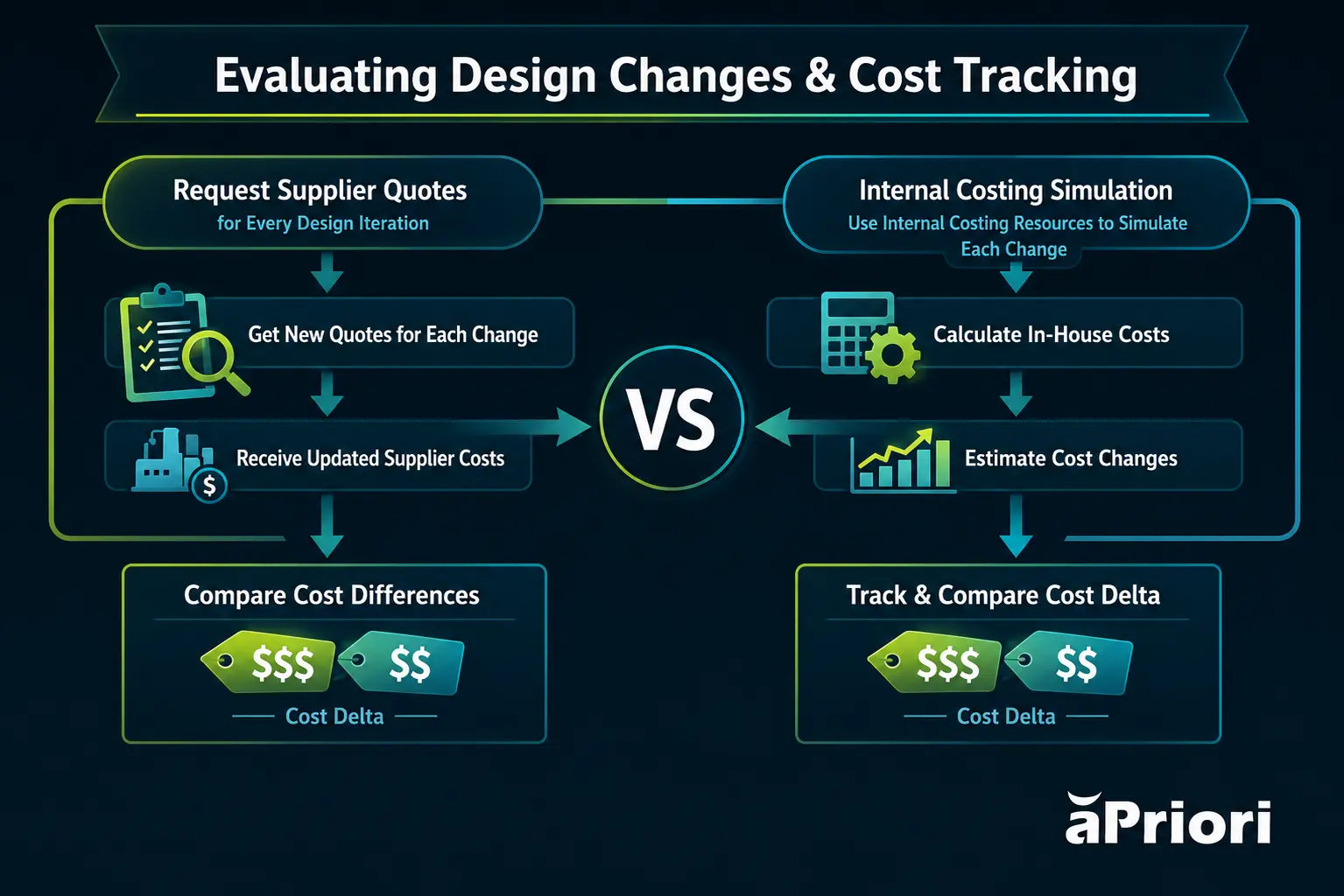
This approach is neither practical nor scalable. Design is all about speed to facilitate time-to-market. Manually tracking a key performance indicator (KPI) that the team is not usually accountable for introduces friction, consumes valuable resources, and ultimately discourages consistent measurement. As a result, much of the value created during design—particularly in New Product Introduction (NPI)—remains anecdotal rather than quantifiable.
This is especially problematic for cost avoidance. Unlike Value Analysis/Value Engineering (VAVE) initiatives, where cost reduction is tangible and visible, avoided cost is inherently harder to prove. Without a baseline quote for every iteration, organizations lack the evidence needed to demonstrate the financial impact of better design decisions.
The outcome is a familiar narrative. Engineering teams using aPriori know they are saving money but often need a concrete data source to justify those design decisions to stakeholders. Traditional methods of numerical and data point compilation are time-consuming and cannot draw direct correlations to fully visualize savings. That’s where aPriori’s dashboard can help, clearly and accurately illustrating savings from real-time data-driven insights.
From Estimate to Evidence
The Design Value Dashboard addresses this challenge directly by integrating value tracking into the design workflow and automating it.
At its core, the dashboard design enables organizations to:
- Automatically quantify cost avoidance and cost reduction
- Track design performance across projects, teams, and time periods
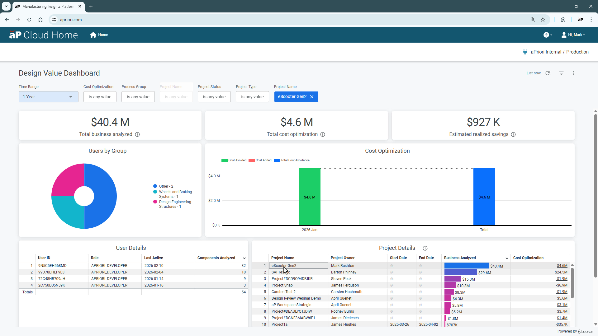
- Aggregate value at component, project, and organizational levels
- Present this critical information in a clear, executive-ready format
This eliminates the need for manual tracking and external validation processes. Instead of relying on disconnected tools or retrospective analysis, value is captured continuously as part of normal engineering activity.
How It Works in Practice
The Design Value Dashboard builds on aPriori’s existing design-to-cost capabilities and introduces a structured approach to tracking and communicating value.
- Continuous Cost Tracking Through Design Iterations
Design engineers can now quantify the impact of their informed decisions across iterations. By automatically identifying a baseline (the earliest iteration) and a current state (the latest iteration), the system calculates cost deltas without manual intervention.
This enables:
- Real-time visibility into cost improvements
- Measurement of both incremental and cumulative impact
- A clear link between engineering’s data-driven decisions and financial outcomes
- Project-Based Value Aggregation
Individual design activities are grouped into projects, allowing value to be aggregated across components, assemblies, or initiatives.
This is critical for aligning engineering work with business priorities, such as:
- VAVE programs focused on cost reduction
- NPI programs focused on cost avoidance and risk mitigation
By structuring work in this way, organizations can move from an isolated field of vision to portfolio-level visibility and actionable insights.
- Executive-Level Dashboarding
The Design Value Dashboard provides a management-focused, project-level view of cost avoidance and design activity.
Key capabilities include:
- Calendarized breakdowns of value creation
- Filtering by project, team, department, or timeframe
- Drill-down into granular contributing design activities
- Clear attribution of value to engineering efforts
The result is a single source of truth for design-driven financial performance.
After several months of beta testing, the feedback was universally positive. As with all software, this is not the finished product. It is a starting point, and one with obvious potential.
One of the companies testing the beta version explains:
“The design value dashboard has the potential to be incredibly valuable for us. It offers a streamlined way to track cost avoidance and design impact, providing crucial visibility for our quarterly leadership report-outs. This will not only replace significant manual effort but also equip us with the data needed to ensure we’re meeting financial targets and making informed strategic decisions in our executive meetings.” Dakota Dawson, Cost and Value Engineering Manager, Dana Incorporated.
Unlocking Value Across Use Cases
The impact of the Design Value Dashboard spans multiple high-value use cases:
- NPI (New Product Introduction): Making Cost Avoidance Visible
- VAVE: Scaling Cost Reduction Efforts
- DFM (Design for Manufacturability): Quantifying Engineering Effort
In NPI, the majority of value comes from avoiding cost before it is ever realized. Historically, this has been difficult to quantify due to the lack of comparable baselines.
The dashboard changes this by automatically calculating cost avoidance across iterations—without requiring supplier RFQs or manual analysis. This makes previously invisible value measurable and defensible.
For VAVE initiatives, the dashboard provides a structured way to track and accumulate savings across multiple improvement activities.
Even small optimizations—often overlooked—can now be captured and scaled. As noted in internal examples, seemingly minor savings can translate into significant financial impact at production scale.
DFM analysis has traditionally been viewed as a qualitative discipline. While its importance is widely understood, its financial contribution is rarely measured.
By linking DFM-driven design changes to cost outcomes, the analytical dashboard enables organizations to:
- Quantify the value of engineering time spent on analysis
- Justify investment in design optimization activities
- Reinforce best practices earlier in the lifecycle
Why This Matters for Leadership
For executives in discrete manufacturing, the implications are significant. The Design Value Dashboard provides:
- Transparency into how engineering contributes to profitability
- Accountability through measurable performance key metrics
- Alignment between design activity and business objectives
- Confidence in ROI from digital engineering investments
It also addresses the long-standing challenge of proving the value of tools and processes that influence outcomes.
Difficulty in demonstrating ROI—particularly in NPI—has been a barrier to companies investing in tools to help innovation. By making value explicit, the dashboard helps organizations overcome this barrier and scale design optimization practices.
A New Standard for Design Performance
The launch of the Design Value Dashboard marks a shift in how engineering impact is understood and communicated.
Design is no longer just about geometry, function, or compliance. It is a primary driver of cost, quality, and competitiveness. With the right visibility, it can also be a measurable and managed contributor to business intelligence performance.
In the words often attributed to W. Edwards Deming: “If you can’t measure it, you can’t manage it.”
For the first time, design teams have a practical, scalable way to measure what matters—and to demonstrate the full value of their daily decision-making.
What’s new isn’t just an operational dashboard. It’s a new level of data visualization into the (now measurable) impact of engineering.
Product Development Stalled? Fast Track It With aPriori
aP Design shows you how manufacturing intelligence and actionable insights optimize design early in product development, accelerating time-to-market and boosting profit margins.