Resources Hub

aPriori Discovery Dashboard: Uncover What’s Hidden

Mark Rushton
— September 29, 2026
Listen to this Article
1×
00:00
00:00
Key Takeaways:
- Measuring design engineers is challenging: their cost optimization and design for manufacturability (DFM) fixes are hard to quantify and often untracked. This work used to mean unrecognized cost savings, until now
- aPriori’s new Discovery Dashboard rolls up totals across the design team, visualizing in-progress scenarios so leaders can see potential value at a glance, without additional work
- The result: teams can spot opportunities for cost reduction, manufacturability improvements, and cycle time optimization long before they polish a scenario enough to share
The Full Article
Imagine you’re a design engineer on the product development team. You’re 80% through a promising improvement to Product A when a new project on Product B pulls you away. The work still mattered. It just wasn’t the priority anymore, and no one ever finished it. This happens all the time: priorities shift, and engineers set aside in-progress work at any stage, leaving it unpublished and unseen.
Most of an engineering team’s value lives in the scenarios its members tried, compared, and set aside before finishing a design. It’s exploratory work that never becomes visible. Earlier this year, aPriori introduced the Design Value Dashboard, giving teams a clear, automated view of the cost avoidance and reduction that finished, published work delivered. It answered a real question: what has engineering already proven? But it could only show work mature enough to share. Everything still in progress, including the comparisons, the near misses, the ideas that didn’t quite make the cut, stayed out of view.
aPriori recently released the Discovery Dashboard to close that gap, the newest addition to its suite of reports and dashboards.
The Work Nobody Sees Until It’s Finished
aPriori lets design engineers continually explore and unlock opportunities for innovation. For every scenario a team reviews, approves, and shares, several more never leave an individual’s workspace. Some were early drafts. Others were comparisons against an alternative material or manufacturing process. The rest were simply parked when other priorities took over.
Most organizations still measure design engineers against a single metric: whether they hit their deadline. The cost reductions and manufacturability fixes they contribute in the process are just as real, but no one tracks, credits, or reports that work consistently.
None of that work is wasted, but almost all of it is invisible. Because it isn’t published, it never appears in project rollups or reaches managers, and it doesn’t factor into how a team understands where its cost and manufacturability opportunities really are. A meaningful reduction in product costs might already exist in an unpublished scenario sitting on someone’s desktop, and no one beyond that engineer would ever know to look for it.
This is the blind spot the Design Value Dashboard never solved, because it measures work only from the point of publishing.
Introducing the Discovery Dashboard
The new Discovery Dashboard gives teams a rolled-up view of everything happening in aPriori that hasn’t been published yet. It doesn’t require anyone to finish, review, or share a scenario before counting it. It consolidates totals across in-progress work at the project, team, and organizational level, so leaders can discover opportunities rather than stumble upon them.
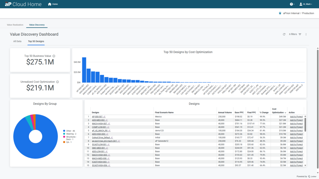
Where the Design Value Dashboard answers “what has engineering already achieved?”, the Discovery Dashboard tackles a different and equally important question: “what could we still find?” It shapes a scattered pile of individual exploration into a single, high-level picture of where cost, manufacturability, and cycle time improvements are already within reach.
How It Works
The Discovery Dashboard builds on the same design to cost (DTC) data every aPriori user already generates, and organizes it into a discovery layer that sits above individual scenarios:
- Aggregated totals across published scenarios, rolled up by project, team, department, or timeframe, even before anything is finalized
- Opportunity indicators for cost, manufacturability, and cycle time, flagging where in-progress work on a design already points to a meaningful improvement
- Drill down into contributing scenarios, tracing a promising rollup back to the specific work behind it
- Visibility into cost swings, up or down, whether driven by design changes, material substitutions, or shifts in annual volume. It surfaces the scenarios behind the biggest cost increases or decreases, so teams can trace what happened and what drove the change
- A single view across the organization, giving leaders visibility into the full body of design exploration, not just the portion already published
Unlocking Value Across Use Cases
The impact of the Discovery Dashboard spans the same important use cases the Design Value Dashboard already supports, but earlier in the process, well before anything is complete:
- Cost Reduction (VAVE): Spot promising unpublished comparisons across the team before they’re lost or forgotten and prioritize which ones are worth formalizing and publishing. If a project runs over its cost target, drill into unpublished scenarios to find room to claw cost back
- Cost Avoidance (NPI): See where early exploratory iterations are already trending toward a lower-cost design, well before a baseline quote would normally exist
- Manufacturability (DFM): Catch manufacturability flags in scenarios that no one has reviewed yet, so problems surface earlier in the design process
- Cycle Time: Identify where teams are hitting bottlenecks, iterating heavily without converging, so they can redirect effort before it’s wasted
In every case, the principle is the same: value doesn’t start when a scenario is published, it starts the moment an engineer begins exploring. The aPriori Discovery Dashboard simply makes that earlier work visible.
Why This Matters for Leadership
For engineering and manufacturing leaders, the Discovery Dashboard closes a visibility gap that the Design Value Dashboard couldn’t reach on its own. Together, the two dashboards provide:
- A complete picture of engineering value, from first exploration through to published, proven results
- Better prioritization, knowing which in-progress scenarios are worth the time to finish and publish
- Earlier intervention, revealing cost and manufacturability opportunities before they’re locked into a finished design
- Confidence that no high-value work goes unnoticed in an individual’s workspace
- Recognition for engineers, who deliver cost reductions and manufacturability fixes every day, not just credit for hitting a deadline
That awareness compounds: when engineering teams see cost and DFM issues as they work, they deliver better designs on time, which can translate directly into greater market share. Those designs are also lower cost, higher quality, better aligned with sustainability goals, and ultimately more profitable for the business.
A More Complete Picture of Engineering Value
The Design Value Dashboard proved that teams could measure finished engineering work, not just assume its value. The Discovery Dashboard takes that principle a step further: it says the exploratory work behind every finished design is worth measuring too.
Now available, the aPriori Discovery Dashboard gives customers a high-level view of everything still in progress, so teams can uncover cost, manufacturability, and cycle-time gains earlier in the product lifecycle, before a project is finished, not after.
If the Design Value Dashboard is about measuring what’s proven, the aPriori Discovery Dashboard is about finding what’s next.




How Much Has Your Team Already Saved?
See how aPriori's Design Value Dashboard tracks the cost savings your engineers have already delivered on finished, published designs.Read The Blog